Last month a client who runs a chain of physiotherapy clinics asked us why their enquiries had dropped even though ad spend was up. We opened their site on a mid-range Android phone, the kind most of their patients actually carry, and the answer was obvious within ten seconds. The booking button sat below three paragraphs of text, the phone number wasn't tappable, and the menu covered half the screen when it opened.
The site wasn't broken. It was just built for a desktop that hardly anyone uses to find a physio.
Here are the signs we look for when deciding whether a site needs tweaks or a proper mobile-first rebuild.
1. Your analytics say "mobile" but your design says "desktop"
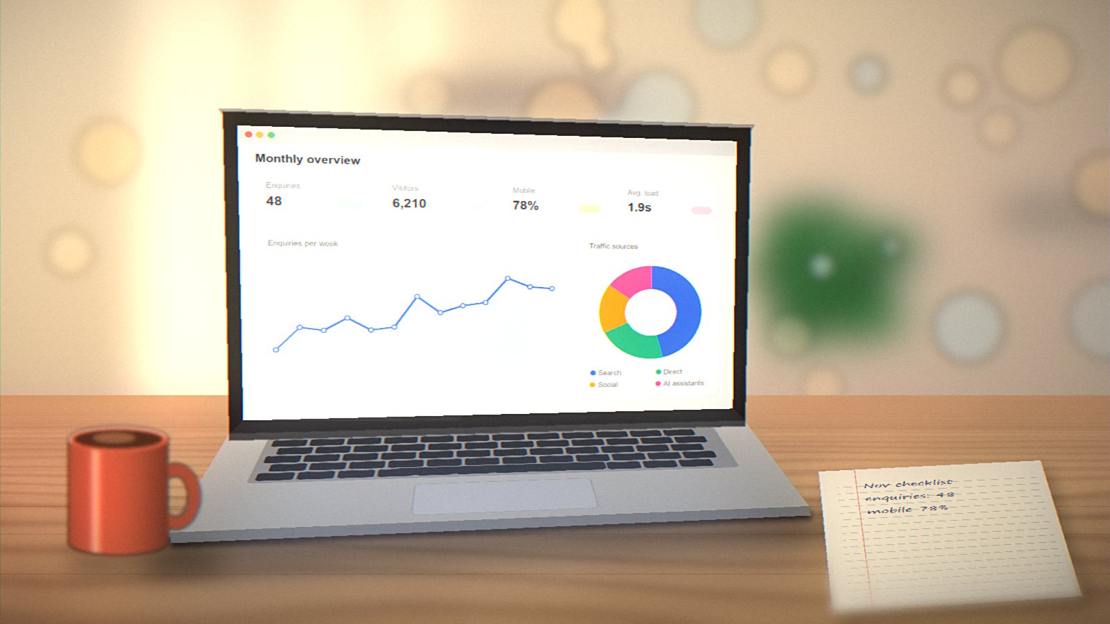
Open Google Analytics and check the device split. For most Indian small businesses we work with, mobile is somewhere between 65% and 85% of traffic. If your site's layout decisions were made on a 1440px screen, you're designing for the minority.
2. People have to pinch and zoom
If anyone needs to zoom to read a price or tap a link, that's a lost visitor. Body text below 16px, tightly packed links, and tables that run off the side of the screen are the usual culprits.
3. Your phone number isn't a link
This sounds small. It isn't. A tel: link turns your number into a one-tap call. For service businesses, that tap is often the whole conversion.
4. Forms are a chore
Long forms with tiny fields, no correct keyboard types (number pad for phone, email keyboard for email), and validation errors that only show after submit. Every extra field costs you enquiries. We usually cut contact forms down to name, phone, and a short message.
5. Pages take more than three seconds on 4G
Large hero images, autoplay sliders, and five different tracking scripts add up. Test your site with PageSpeed Insights and look specifically at the mobile score. A score in the 30s or 40s is common and fixable.
6. The menu is a maze
Desktop mega-menus rarely translate well to a hamburger. If your mobile menu has three levels of nesting, visitors give up. Keep the top level to five or six items and put the most important action (Call, Book, Get a Quote) outside the menu entirely.
7. Your competitors' sites feel easier
Do the honest test. Open your site and two competitors' sites on your phone, one after another. Which one would you use if you were in a hurry? Your customers are doing exactly this comparison, usually while standing in a queue or sitting in an auto.
Tweak or rebuild?
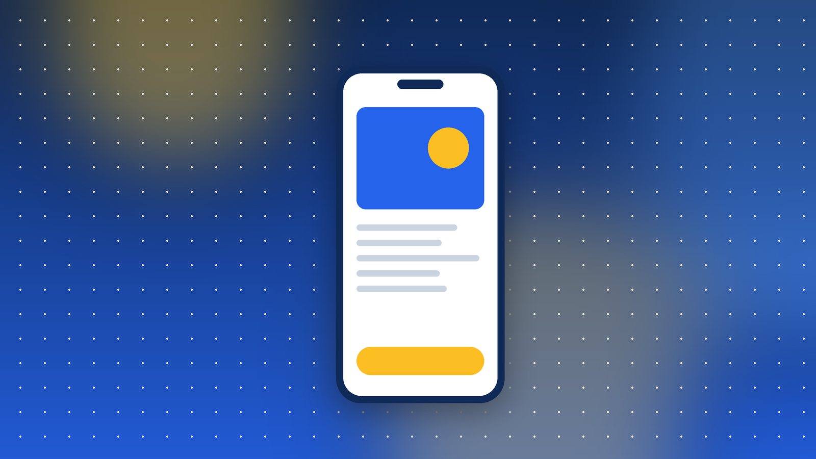
If you're seeing one or two of these, a few targeted fixes will do. If you're seeing four or more, you're probably fighting the original design, and a mobile-first rebuild ends up cheaper than patching forever. Mobile-first simply means we design the small screen first and then let the layout expand for larger screens, rather than the other way round.
For the physio client, we rebuilt the homepage and booking flow in about three weeks. Enquiries from mobile went up by a little over 40% in the first two months, with the same ad budget. Nothing clever, just a site that respects the device people are holding.